Content Style Guide for large teams
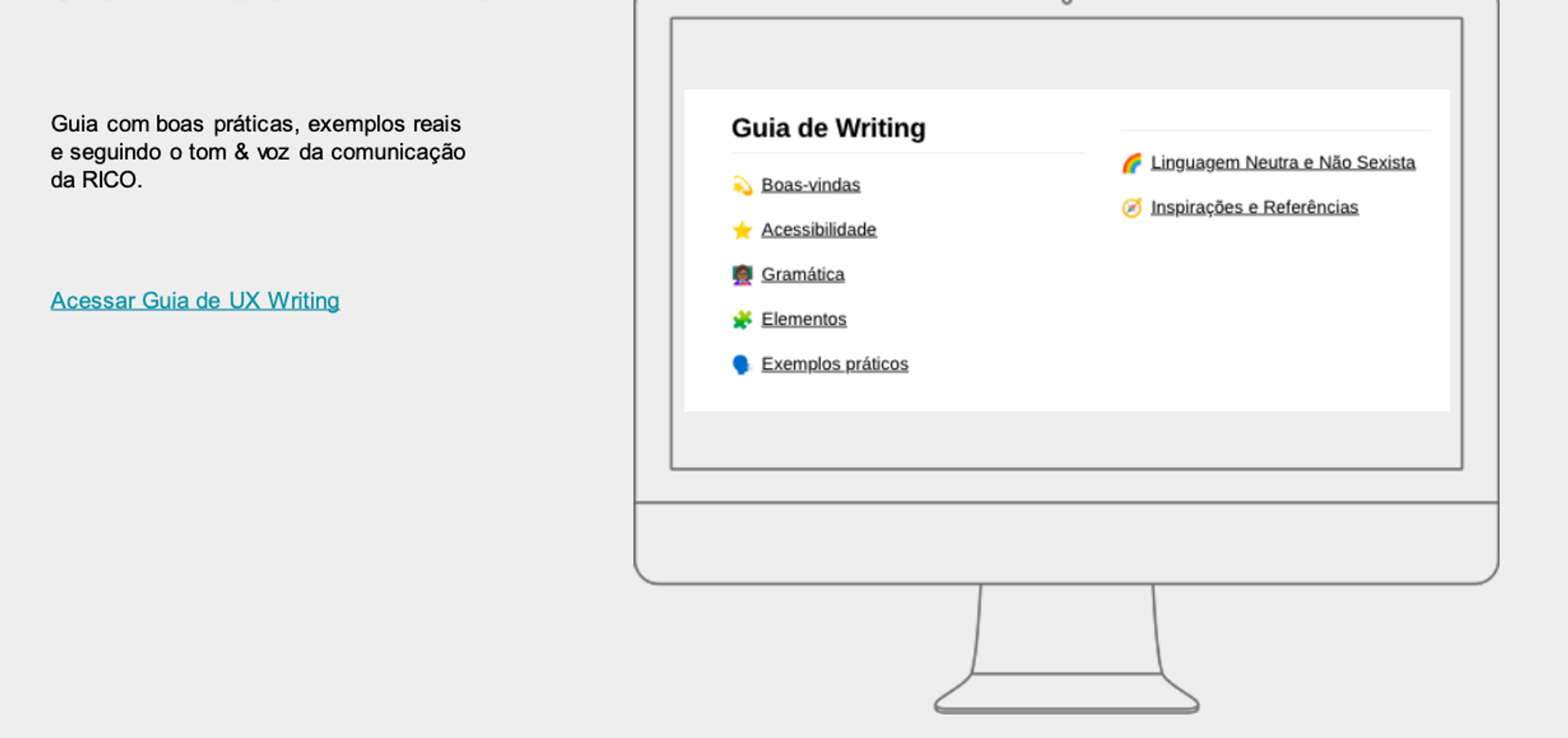
Empower any stakeholder to write following Rico’s Tone & Voice guidelines. This way, even those who aren’t UX Writing professionals can write with the same style as the product team.


Analyze, review, and document the writing model to be followed, outlining what can and cannot be said, written, or spoken about the brand. Provide tools so that everyone can write consistently while respecting Rico’s guidelines.
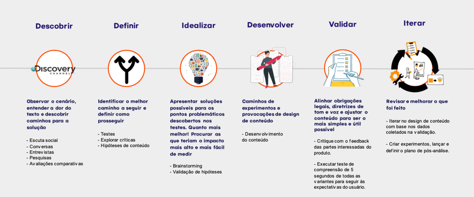
– 6-step UX Writing process
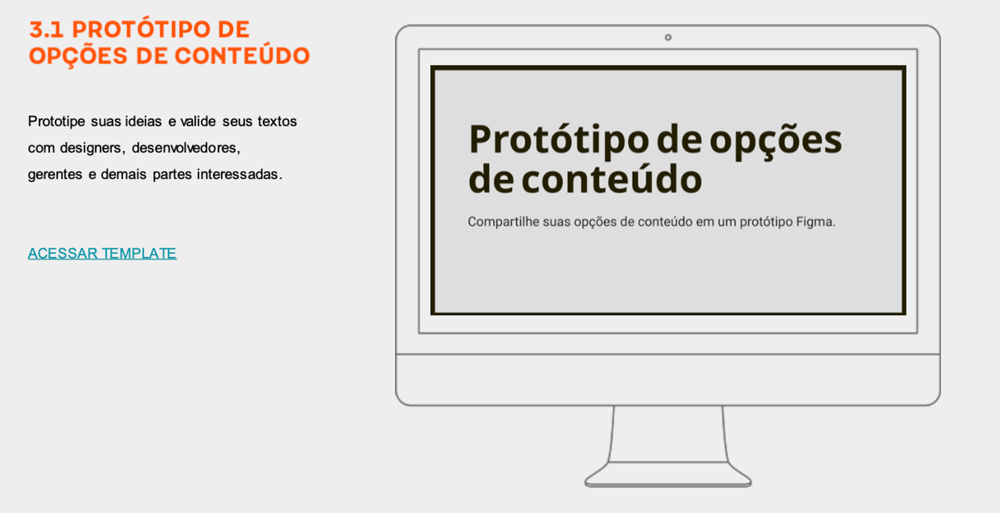
– Content Options Prototype
– Content Variants Matrix
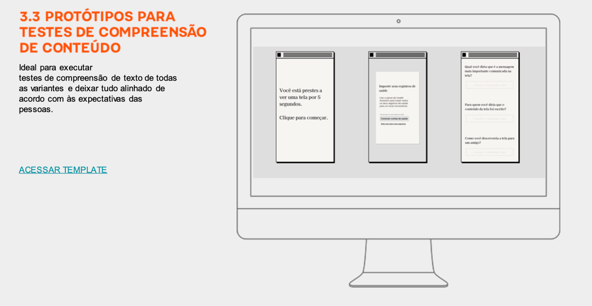
– Implementation of Content Comprehension Tests
– Guidance for using Plain Language
Creation of Rico’s Content Design Style Guide 👇

It also allows scaling processes while maintaining consistency with other teams, improves task measurement, and provides better visibility into what’s being done at each stage of the process.

It works as a draft template based on the channel (portal or app) and allows the text to be implemented in a Figma interface. The text can also be documented, suggested, commented on, reviewed, validated, and versioned.

After the display, they complete a questionnaire with 6 questions:
– What was the most important message on the screen?
– Who was the content intended for?
– Did the content remind you of anything?
– How would you describe what you saw to a friend?
– What content would you remove?
– What content would you add?
Based on their answers, the content is either revised and moved to production or sent back for further development.
– Saving Time: Simple content is faster to digitize and easier to understand. This means less work for support teams, more customer engagement, and fewer product issues.
– Stress: When people are anxious, they struggle with complex language. How’s everyone coping in 2022?
– Multitasking: With so many distractions, online users need clear and simple information. This is especially true in the TikTok era.
– Educational Gap: Most of our audience might not know or understand complex words.
– Cognitive Disabilities: Using simple language reduces mental effort. The simpler the message, the easier it is to process.
– Motor Disabilities: Clear and concise content is easier to navigate, requiring less physical effort.
– Non-Fluent Speakers: People learning the language benefit from simpler content.
– Sign Language: Users For those whose first language is sign language, standard vocabulary can be too complex.
– Hearing Loss or Low Vision: People who use audio tools or screen readers find it easier to understand simplified content.
– Autism Spectrum: Jargon can be a barrier for people with autism. Simple language improves understanding.

Due to privacy and confidentiality concerns, certain content cannot be shared here.